Every now and then, redesigns need to happen. It’s never an easy job, because you want to please everyone. However, with a clear head and a tight-knit team, you can put together the feedback you received from your users and the best UX practices and come up with a better product.
For those who already know the POEditor localization platform for a while, we’ve put together this blog post to present the main design changes. Rest assured that they’re not that big.
Options Menu moves to the top
For easier navigation, the Options Menu in the Project Page was moved to the top of the work space.
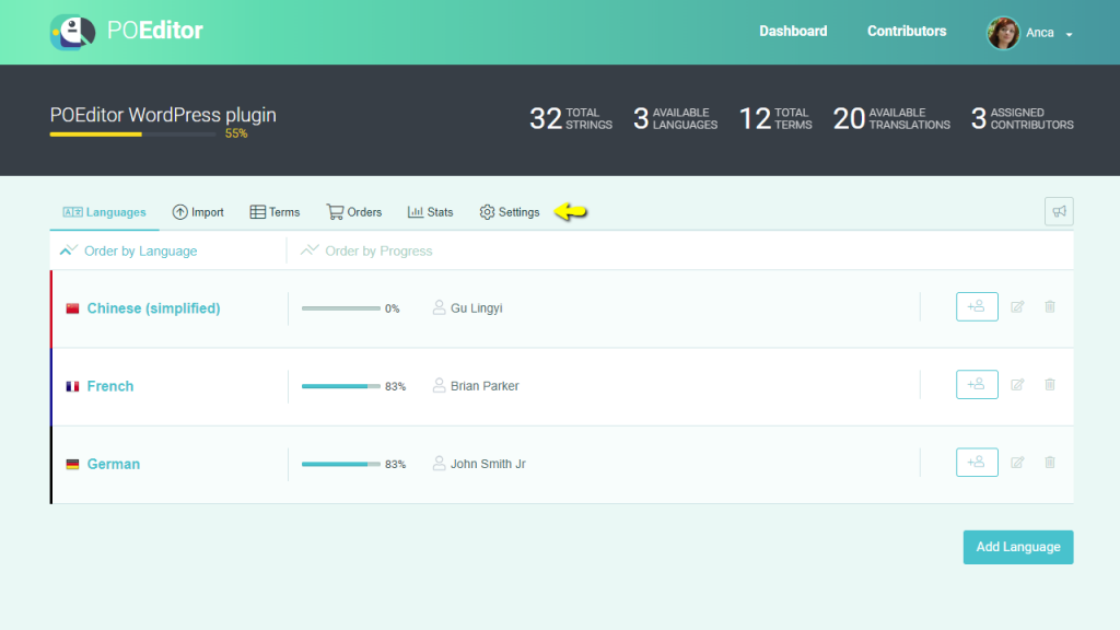
The same happened to the Options Menu in the Language Page.
View or Add Terms gets a makeover
The View or Add terms page finally got the attention it deserved. We renamed it Terms and had our designer give it a fresher look.
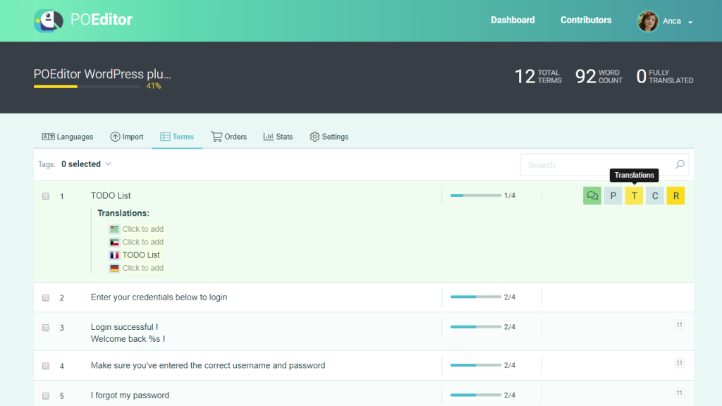
Navigating between various pages at project level as well as at language level should also be easier from now on. This is because the menu never disappears, regardless of the page you’re working on.
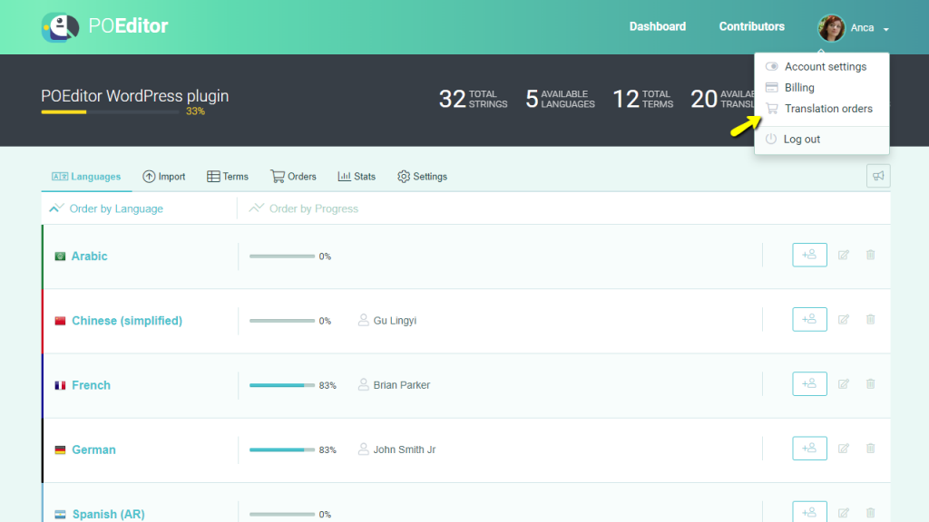
Translation Orders also moves
We also moved the Translation Orders feature on account level, to make it easier to find for old and new users alike.
On top of these three main (not exactly dramatic) design changes, we’ve also made some minor tinkerings here and there, where there was room for improvement.
And that is all. Nothing too major, because POEditor has already proved that it works. And we know very well that we have a duty to preserve the product our already existing pool of users and customers know and love.