If you’re a POEditor user, you may have noticed that the go-to platform for managing your software localization projects has a new design as of November 2022. 😊
A long overdue redesign, if you ask our product team, who’ve been tackling heads on the eternal puzzle of any product team: how to add new, necessary options to the interface without making it feel cluttered and overcrowded.
How the new design came to be
Have you ever tried to get in touch with our team, to ask for help or to share an idea? If you did, we hope two things were evident – that we’re always very responsive and that we’re also very curious to hear your feedback.
User feedback is key to our product development, and for this reason it always gets its spotlight in our meetings. After collecting all your input, our support team diligently compiles it for our product team, who then attentively discuss it. If there is obvious demand to add or adapt something, the product and dev teams begin to look for ways to implement your ideas.
So a big thank you to everyone who has shared their thoughts over the years. Your contribution has shaped POEditor to be the localization platform and translation management system you are using today.
What we wanted to achieve with the updated design
For POEditor’s 2022 redesign, we wanted a fresh take on the look you were accustomed with. We also wanted to keep all the UI elements that proved to work and to improve the ones causing pain points.
Relying heavily on data gathered from support cases, we improved the interface in places where people obviously had difficulties.
These changes opened up new opportunities. Thus, where possible, we also tweaked the interface to make it more clear in terms of accessibility, structure and taxonomy.
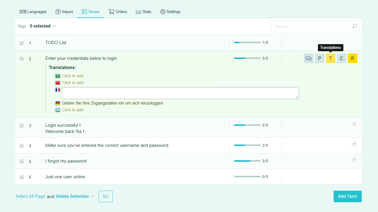
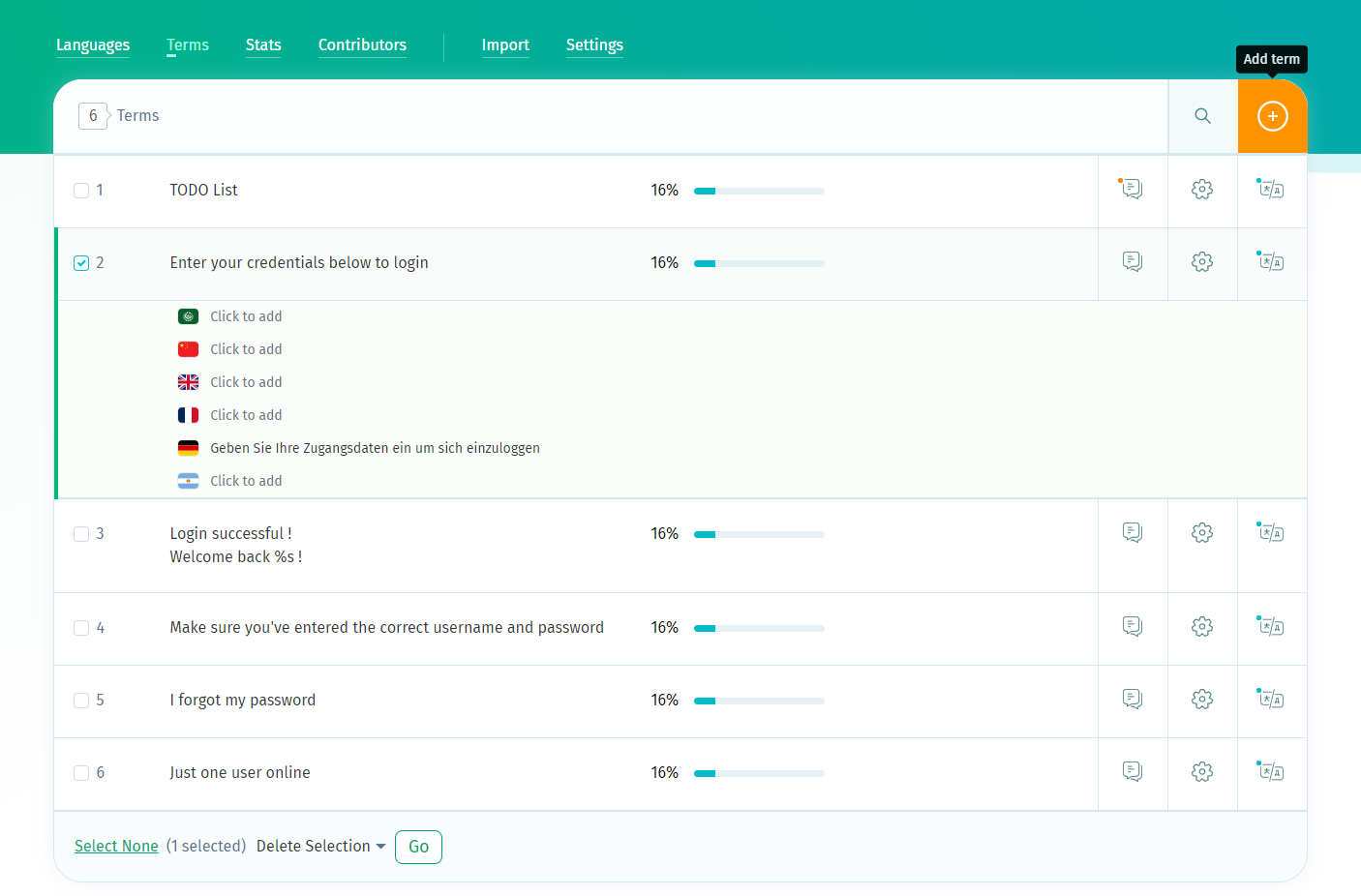
What has changed in the new interface
The first thing to notice about the new design is the consistently updated presentation site. Apart from this, here are the main changes between the old POEditor UI and the new one:
- we replaced the forms that opened inline with modals and slide-ins, which are more familiar to nontechnical users;
- we made the content box wider, so we could insert more whitespace and increase the fonts a little, to make the interface more accessible;
- we reorganized some modules, in order to make room for new features we have planned;
- we also reorganized some menus that were overcrowded, for better UX and to make room for potential new options;
- where possible, we improved the taxonomy to improve clarity.
All the updates brought by the new design were subject to a successful soft launch. During this period, many of you offered valuable feedback. We actually took some important decisions based on the input we received, and for this we thank you once again.
What’s up ahead
Wondering what’s next after this chapter in POEditor’s product story? We’ve a variety of small changes and adjustments on our roadmap, whose purpose is to fine-tune the features that already exist. We also have some bigger features in store, that will begin to be rolled out in 2023.
Please feel welcomed to send your feedback our way at any time, using our contact form or directly to info@poeditor.com. We assure you we will consider all of it.