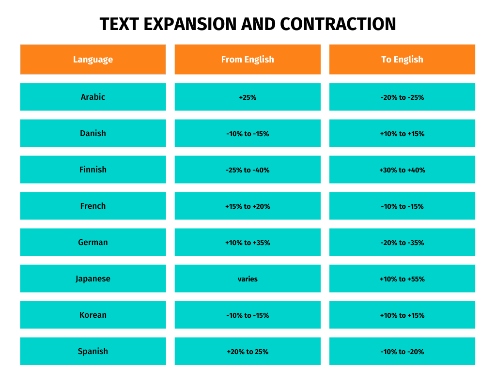
When working on a localization project, one of the most common problems you will encounter are those related to text expansion and contraction. What do you do when your translated text is longer or shorter than your source text, thus affecting UX? Below, we discuss effective strategies to mitigate potential risks.
About text expansion and contraction
Translating content from one language to another often results in expansion or contraction, and this is due to linguistic and structural differences. Some languages tend to require more words or longer phrases to convey the same meaning, while others may condense phrases more efficiently.
What’s the reason for all this? Well, the differences in grammar, syntax, and cultural context are some of the common reasons that drive expansion and contraction. For example, languages with complex grammatical rules (such as Russian or Polish) may require additional words or modifiers, leading to expansion.

The impact on interfaces and SEO
Text expansion can impact the visual layout of software interfaces. For example, a button with a fixed width may look fine in English but overflow in French or German. Ideally, designers think of these aspects beforehand and allow extra space or choose fonts that can scale smoothly for multiple languages.
Another consideration that might get overlooked is multilingual SEO. When text expands in translation, the density of keywords may decrease. This could possibly affect how search engines view the relevance of a page for specific keywords. Certain keywords may also need to be adapted to suit cultural and regional nuances, which may lengthen or shorten phrases.
We all know that titles and meta descriptions have strict character limits. Expanded translations may exceed these limits, leading to truncated titles and descriptions in search results. Localizing SEO-related elements means you will often need to rewrite to keep the most important information within limits.
Design with flexibility
Designing with flexibility means using UI components that can adjust based on content size, so you won’t need to redesign with every new language. Flexible layouts, such as using auto-resizing containers rather than fixed-width text boxes, allow text to adapt to its container size dynamically. If you’re localizing mobile interfaces this becomes especially useful because you’re dealing with screen space that is often limited.
Another effective strategy is to include padding or whitespace around text elements in the initial design, which provides a buffer to accommodate expansion without crowding other interface components. Allowing text to flow across multiple lines when necessary can also be useful in cases where expansion is unavoidable, such as with lengthy German compound words.
When you proactively design with additional space, ideally around 30-40% for potential expansion, UI components can more easily accommodate various language needs. And you’re also maintaining a clean and structured look.
Set character limits and truncation rules
Managing text expansion and contraction isn’t solely a design challenge; content strategy plays a role as well. It’s recommended you set character limits for various UI components, such as buttons, titles, and labels. This way, you ensure that content stays within the constraints of the design. These limits also provide clear boundaries for translators.
In cases where text cannot be shortened without losing its meaning, there’s always the option of implementing truncation rules. By displaying an ellipsis (“…”) at the end of truncated text, users are visually cued that more content exists, and designers can provide options, such as tooltips or “read more” links, to reveal the full text.
You may also use line wrapping and hyphenation to handle expanded text successfully. However, note that some languages (Chinese and Japanese, for example) “don’t support” hyphenation. But for languages that allow hyphenation, breaking words across lines can reduce the impact of lengthy words on the layout while preserving readability.
Leverage pseudolocalization for testing
Pseudolocalization is a great way to catch potential layout issues before they reach users. It works by simulating languages with expanded or contracted text so you can test how a UI performs under various scenarios.
The process typically involves using artificially inflated text within the UI, (e.g., adding extra characters or lengthening text strings), which allows you to see where issues like text overflow or layout distortion might occur.
Additionally, during development, you can add visual indicators of text overflow, such as highlighting areas where text spills outside its container. This approach enables developers and designers to refine layouts and address expansion-related issues early in the design and development phases.
Create localization-driven content
Sure, design plays the main role in managing text expansion, but content strategy is just as important. Creating content with localization in mind can mitigate many of the issues caused by language expansion and contraction. Using plain language and avoiding overly complex or idiomatic expressions leads to more concise translations that are often shorter, resulting in more efficient use of space.
For situations where the translations are significantly longer than the original text, you can instruct translators to use shorter synonyms or adapt the phrasing. Dynamic language switching can also aid in this process; by toggling between languages within the UI during development, you can directly assess how text fits across languages and make adjustments as needed.
Adopt scalable typography and iconography
Another thing that can help with text length variation is to use responsive fonts that adjust slightly based on content length. For instance, in a UI where text expansion is prominent, adjusting font size slightly within acceptable limits can help text fit without needing a significant redesign. But that’s not all; you may want to consider avoiding text embedded in images, as images with fixed text cannot be adjusted for various languages. Instead, use text overlays, which allow text to adapt freely.
Conclusion
If you want to keep your UI visually cohesive across languages, you need to address any issues relating to text expansion and contraction. By implementing flexible design practices, setting clear content guidelines, and conducting pseudolocalization, you should be able to manage the challenges that come with translating content for foreign audiences.